Why UK Councils Are Flying Blind on EV Charging Infrastructure
"I was confused why EV charger data looked correct online but failed in real use."
That question stayed with me longer than I expected.
When I began building Autodun, I assumed that public datasets and council reports would match real roads. Official dashboards, industry articles, and government timelines all paint a picture of expansion and progress. On paper, the UK appears well on its way to supporting mass electric vehicle adoption.
But once I started using this data to power real journeys, real maps, and real driver feedback loops, a different picture began to emerge.
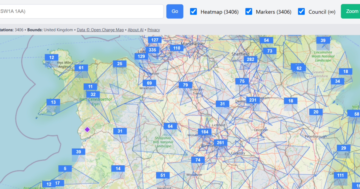
At a national level, charger counts look impressive. Maps are full of markers. Heatmaps glow across cities and motorways. But zoom in, and the gaps become impossible to ignore. Rural areas appear "covered" but hide single slow chargers. Town centres show numbers that don't reflect reliability, access, or real availability.
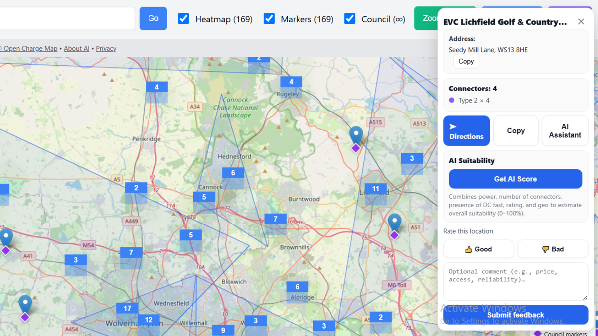
This is not a data accuracy problem in the traditional sense. The chargers often exist. The issue is that most datasets stop at surface-level counts. They don't answer the questions drivers and planners actually care about: Can I rely on this charger? Is it usable today? Does it support fast charging? Is it accessible at night or during peak hours?
As I connected Open Charge Map data with live journeys and user feedback, inconsistencies became clearer. Some chargers listed as operational were unreachable. Others were technically present but practically unusable. In several regions, councils appeared to be planning infrastructure based on incomplete or misleading signals.
This is where Autodun began to shift direction. Instead of treating EV infrastructure as a static dataset, I started treating it as a living system. Chargers were no longer just points on a map; they became nodes with quality, context, and experience attached to them.
By combining live charger data with AI-based suitability scoring and direct driver feedback, patterns emerged that static dashboards completely missed. Some areas with "adequate coverage" were failing drivers daily. Others with fewer chargers were performing better due to reliability and placement.
The problem is not that councils are ignoring EV infrastructure. The problem is that they are often planning with tools that were never designed for real-world behaviour. Spreadsheets and annual reports cannot capture daily friction, failed charging attempts, or user trust.
This disconnect explains why progress feels uneven. Why national targets feel optimistic while local experiences feel frustrating. And why drivers increasingly rely on community knowledge rather than official guidance.
Autodun was built to close that gap.
Instead of asking, "How many chargers exist?", we ask, "How usable is this location for real drivers today?" That difference sounds small, but it changes everything — from planning decisions to funding priorities.
Explore the live EV infrastructure map
Open EV Finder →As EV adoption accelerates, the quality of our infrastructure data will matter more than the quantity. Without ground-truth feedback and real usability signals, councils risk flying blind — even while surrounded by dashboards that suggest everything is fine.
The road to electrification is not just about installing chargers. It's about understanding how they are actually used.
Related reading: EV Charging Reliability UK · EV Charging on UK Motorways · Electric Car Charger Map UK